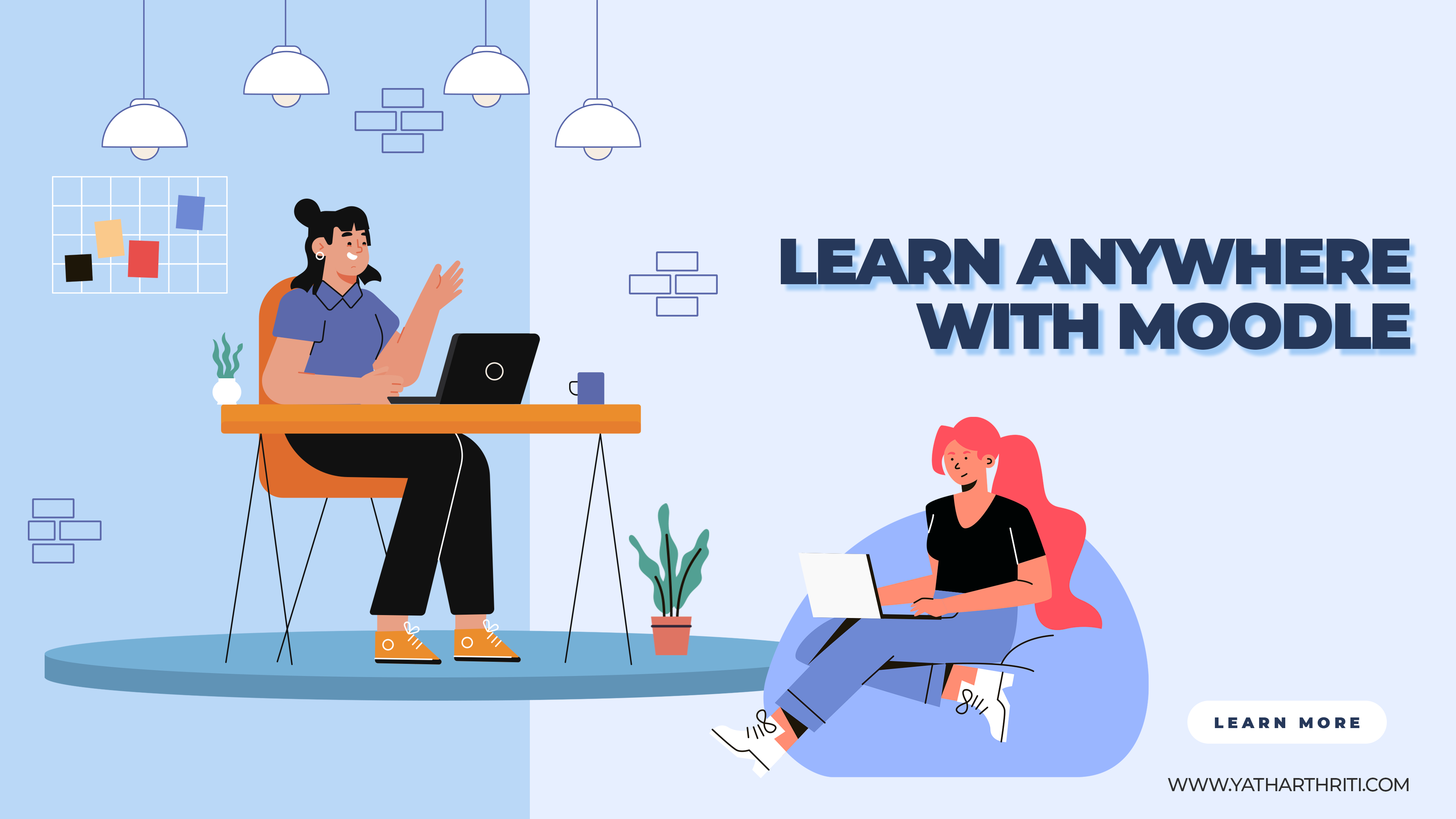
In today’s rapidly evolving digital landscape, education is no longer confined to traditional classrooms. The rise of online learning has ushered in a new era of accessibility and convenience, allowing learners to acquire knowledge from anywhere in the world. At the forefront of this educational revolution is Moodle, an innovative and versatile Learning Management System (LMS) that empowers learners to access their courses effortlessly across a multitude of devices. In this article, we delve into the world of Moodle, explore its remarkable capabilities, and unveil the secrets to accessing it seamlessly from any device.
Elevating Learning Experiences with Moodle
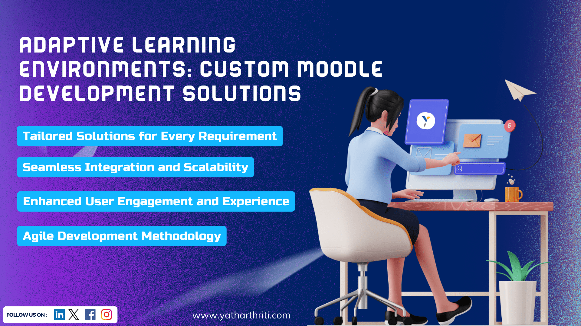
The digital age has sparked a paradigm shift in the way we learn. As traditional educational models transform into digital counterparts, Learning Management System development has emerged as the cornerstone of this transition. An LMS serves as a comprehensive platform for creating, delivering, and managing educational content. Yatharthriti, the epitome of LMS development excellence, understands the pivotal role of LMS in modern education.
Demystifying Moodle Access on Every Device: A Comprehensive Guide
Harnessing the power of Moodle across devices is an uncomplicated process that requires no advanced technical knowledge. Follow this comprehensive guide to embark on your seamless learning journey:
1. Select Your Preferred Browser: Begin by selecting a reliable web browser compatible with your device. Popular choices include Google Chrome, Mozilla Firefox, Safari, and Microsoft Edge.
2. Launch the Browser: Open your chosen browser and enter the URL of your Moodle platform. This URL is typically provided by your educational institution or organization.
3. Access Your Account: Once the Moodle login page appears, input your credentials (username and password) to gain access. If you’re new to Moodle, follow the registration process to create your account.
4. Navigate to Your Dashboard: Upon logging in, you’ll be greeted by your personalized Moodle dashboard. This hub offers a convenient overview of your enrolled courses, pending assignments, announcements, and more.
5. Discover Courses: To access a specific course, either click directly on the course name or navigate through the available categories. Moodle’s user-friendly interface simplifies course exploration and selection.
6. Engage with Course Content: Once inside a course, explore a diverse array of learning materials such as videos, documents, quizzes, and interactive discussions. Moodle’s intuitive design ensures that these resources are effortlessly accessible and well-organized, regardless of your device.
7. Participate Actively: Engage in interactive activities like forums, assignments, and quizzes, actively contributing to your learning experience. Moodle’s responsive design guarantees a smooth and rewarding participation journey, irrespective of the device you’re using.
8. Track Your Progress: Keep tabs on your progress and monitor your grades effortlessly within Moodle. This built-in feature empowers you to stay informed about your learning achievements and areas for improvement.
Evolution of LMS: Beyond Desktop Boundaries
Yatharthriti’s dedication to creating responsive and versatile LMS solutions has paved the way for seamless learning experiences, transcending the limitations of a single device. This accomplishment is especially significant in today’s fast-paced professional landscape, where individuals often find themselves switching between devices while striving to balance learning with other commitments.
The Pinnacle of Responsive Design
Moodle course management system adaptability across devices is powered by its responsive design architecture. Responsive design ensures that the layout and content of a website or application automatically adjust to fit the screen size of the device in use. By eliminating the need for multiple versions tailored to specific devices, responsive design streamlines the user experience and ensures consistency across platforms.
Whether accessed from a smartphone, tablet, laptop, or desktop, Moodle’s responsive design guarantees that the interface remains user-friendly and visually appealing. Buttons, menus, and content seamlessly adapt to varying screen dimensions, facilitating intuitive navigation regardless of the device’s specifications. This level of adaptability is a game-changer for educational institutions and organizations catering to a diverse audience with an array of device preferences.
Navigating the Learning Frontier
As the digital era continues to reshape the landscape of education, Learning Management Systems like Moodle are at the forefront of this transformative journey. The fusion of technology and education has unlocked new horizons for learning. In response to the demands of modern learners for flexibility and convenience, LMS platforms are poised to play an increasingly vital role.
As you embark on your educational voyage – whether it’s a professional certification, a language course, or a personal pursuit – remember that Moodle’s unwavering accessibility across devices will be your steadfast companion.